Kraut und Rüben
Branding
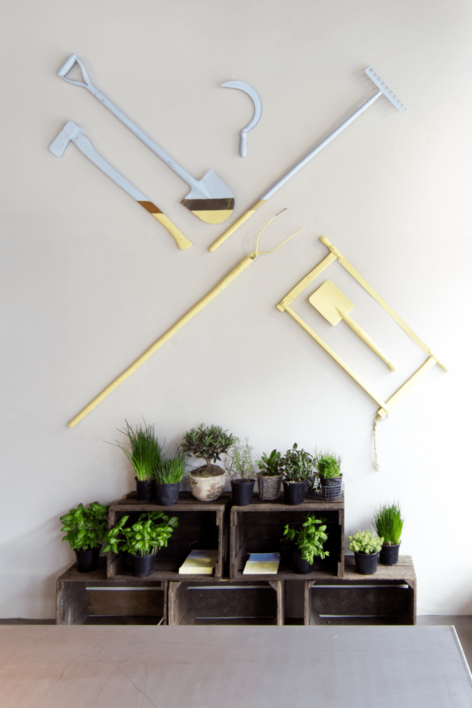
Interior
Art Direction
Interior Design: Penelope Buchwald
Fotos: Maria Brinkop
Repros: David Jankowiak
Architecture Photography: Clemens Müller
Website: Marius Sonnentag
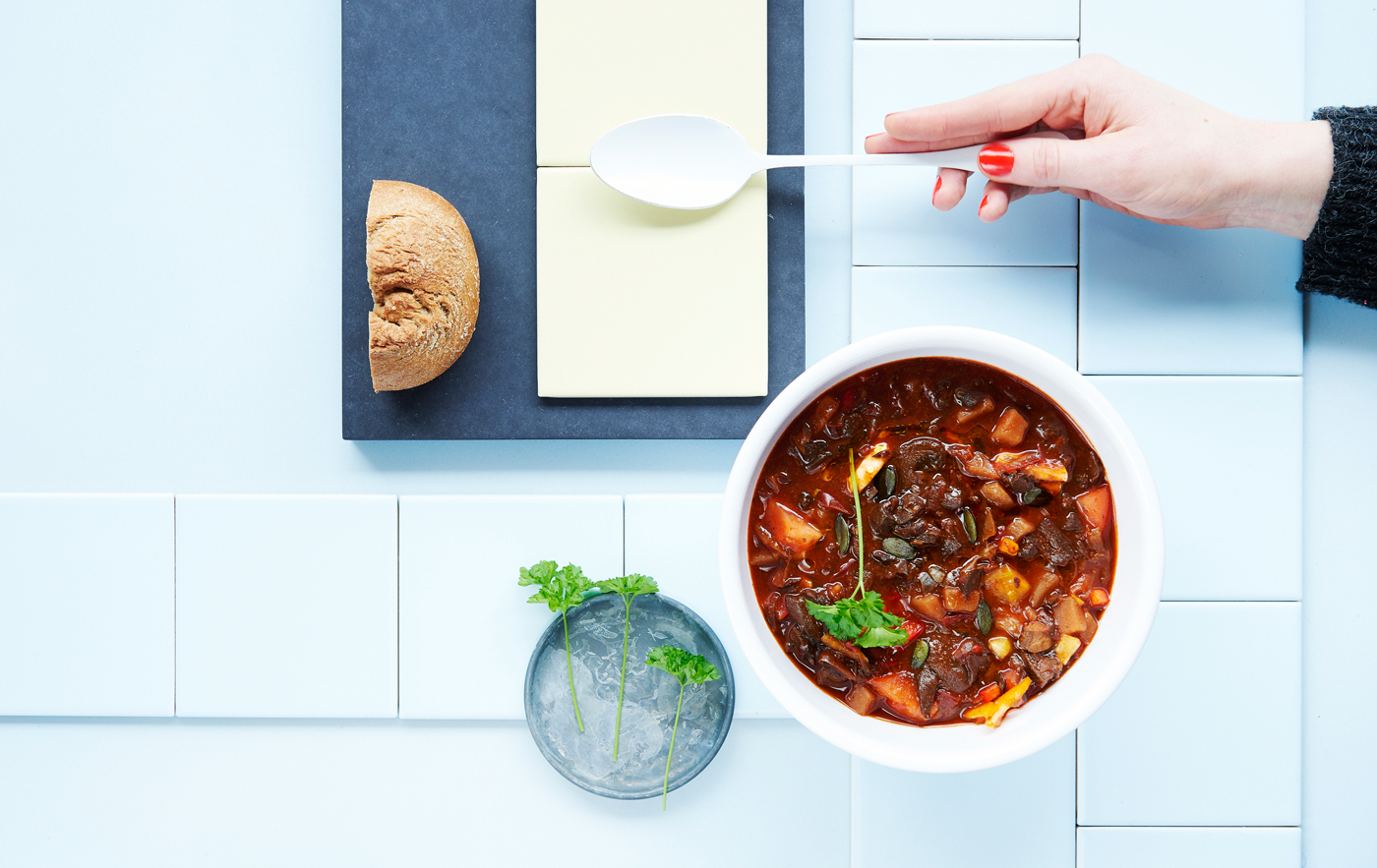
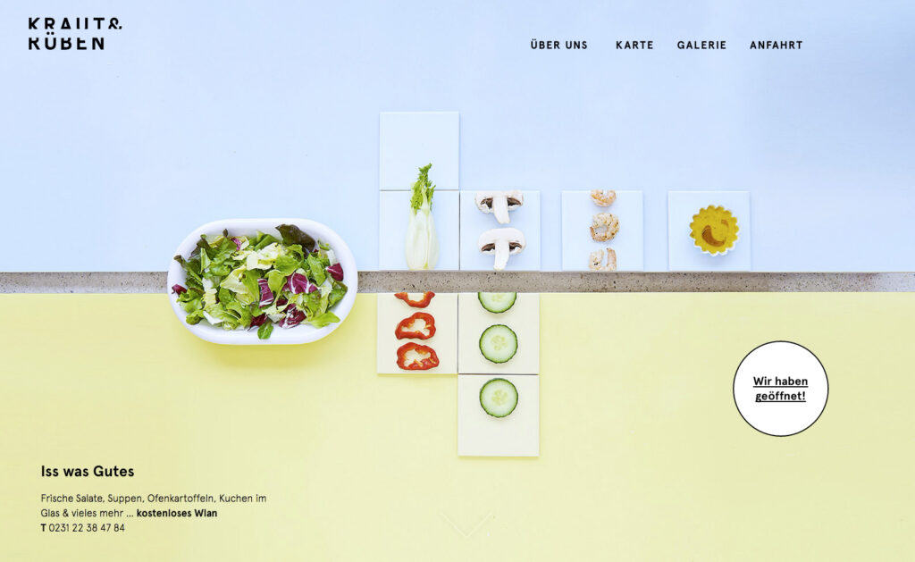
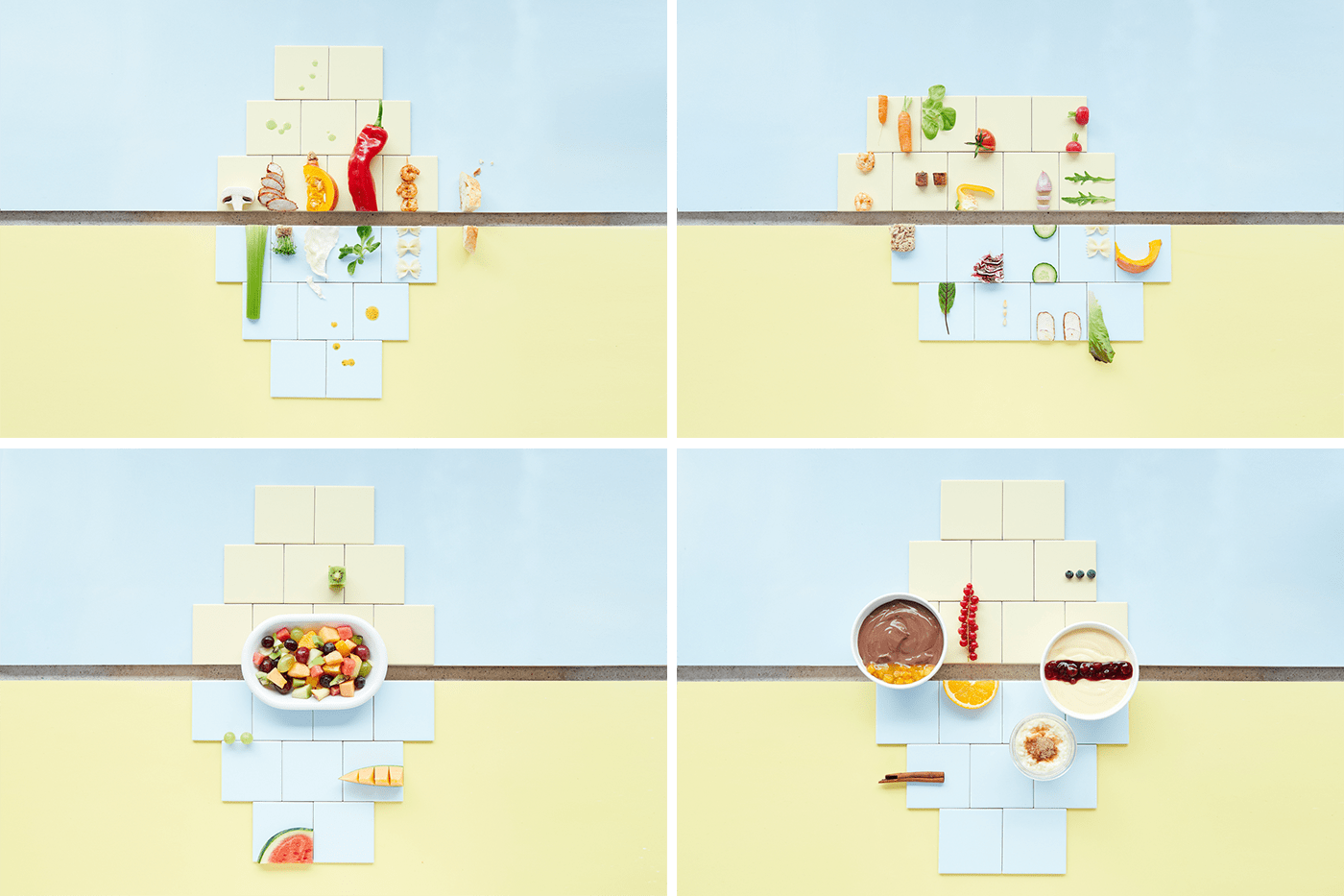
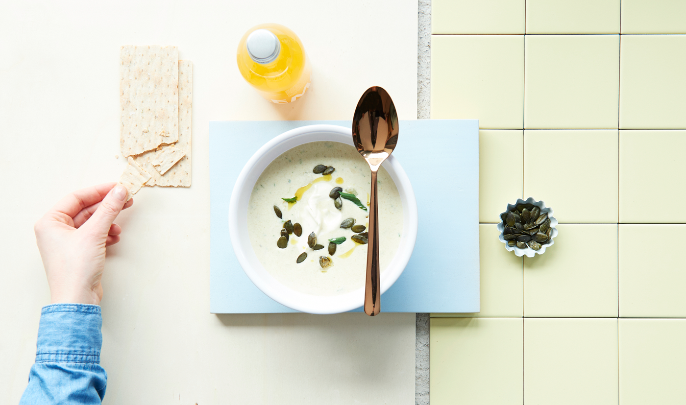
From field to fork. Fresh salads, soups and potatoes right in the centre of an old industrial town.
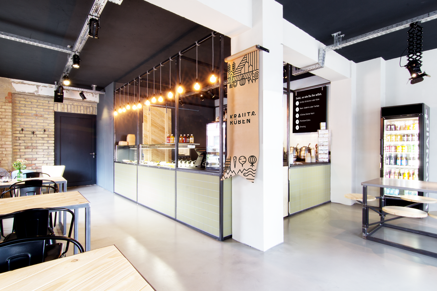
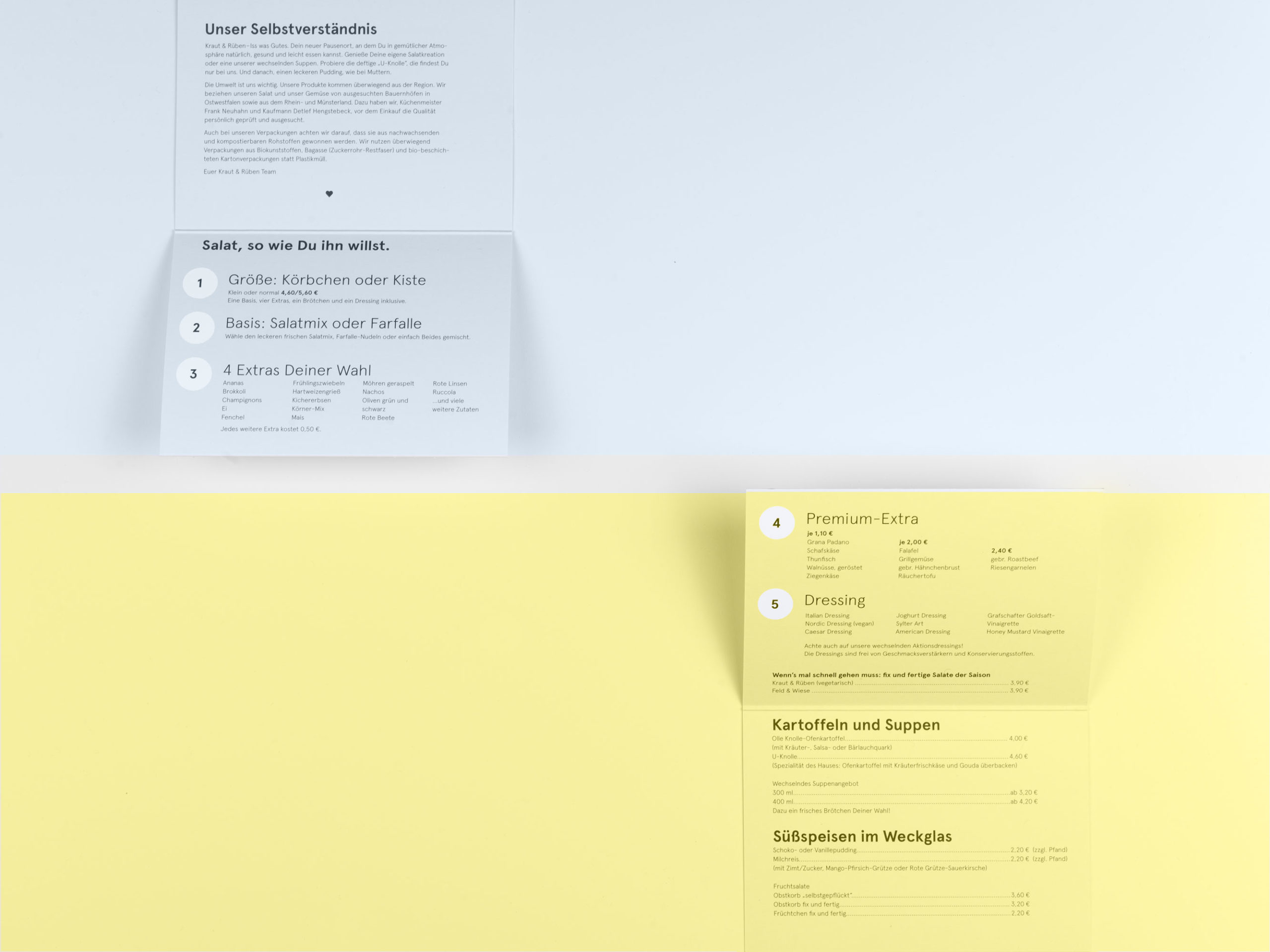
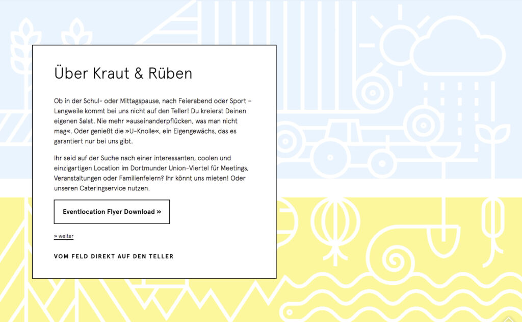
Exposed brick walls, bare light bulbs, and an old barn door: the Kraut & Rüben salad bar and café in Dortmund combines rustic charm with industrial style. Kraut & Rüben focuses on variety using seasonal ingredients.
The design concept is based on a simple principle of nature: cabbage (Kraut) grows upwards, and turnips (Rüben) grow downwards. We decided to create a minimal and concise design without relying on an obvious color choice such as green.
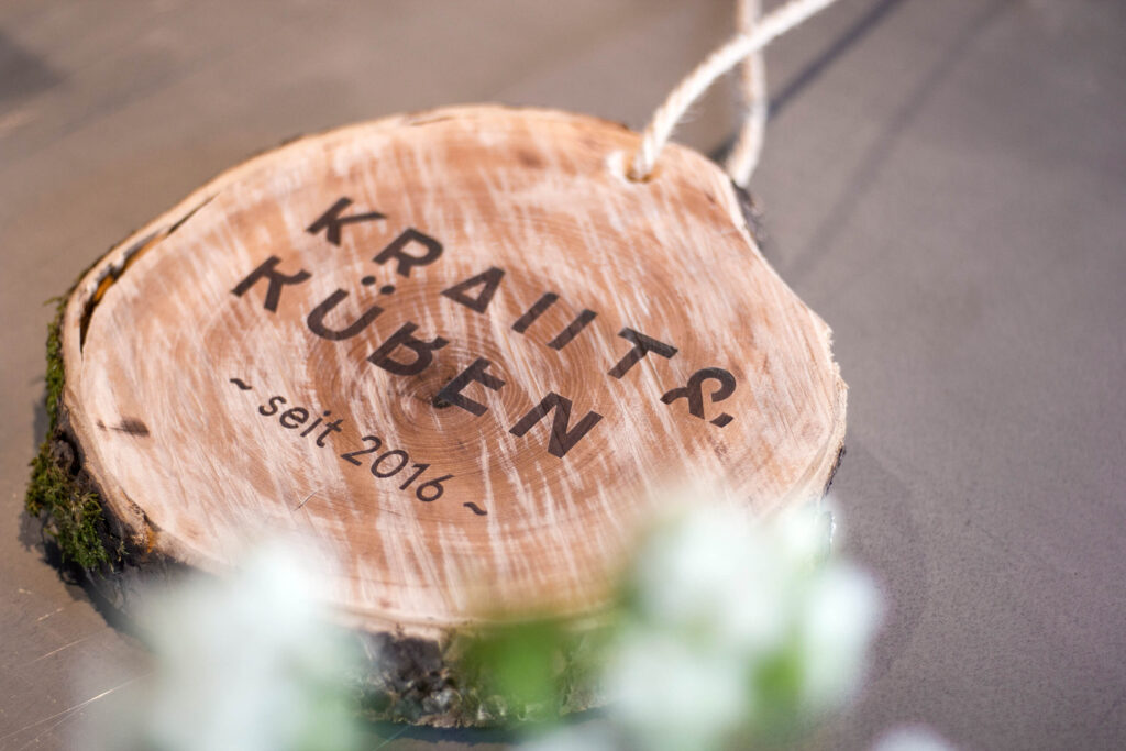
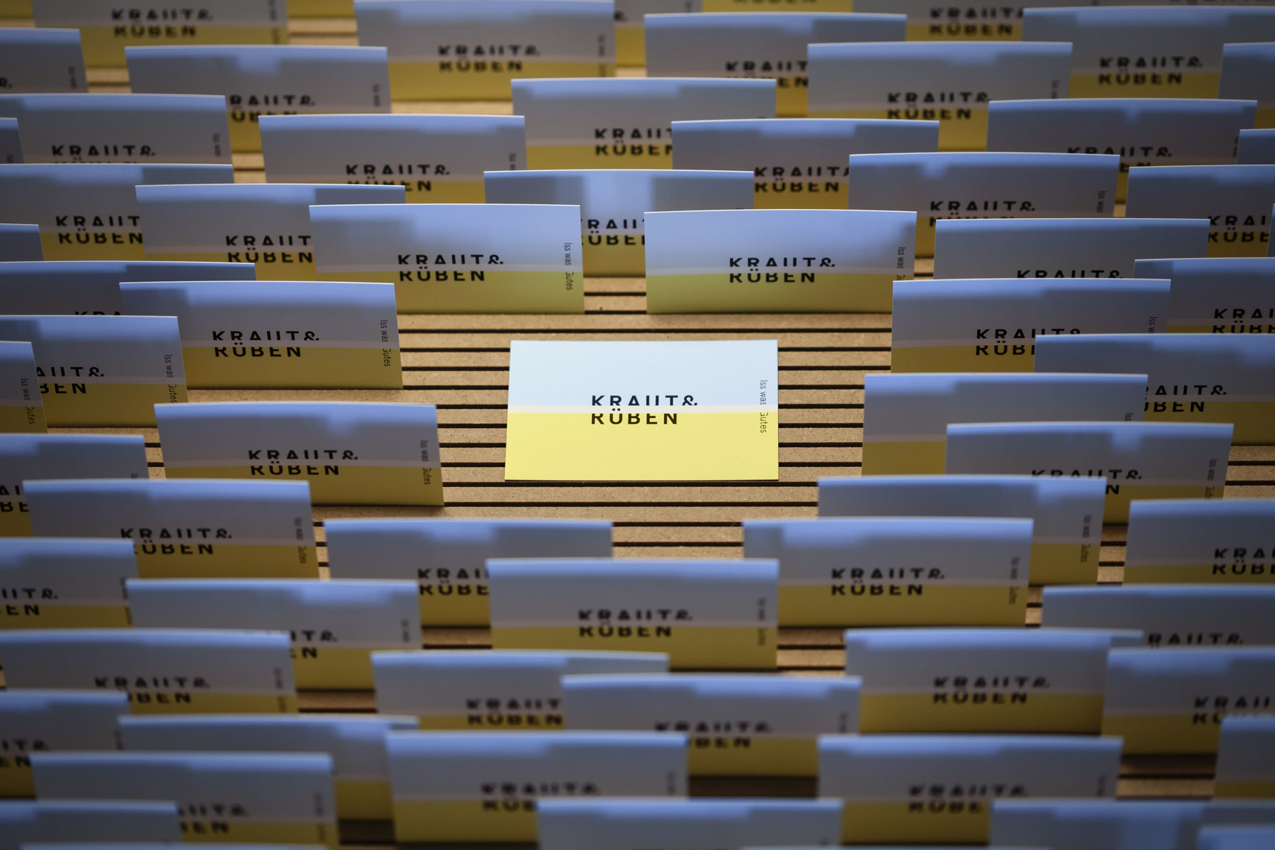
Colophon’s Aperçu typeface was the perfect fit for Kraut & Rüben. It was slightly altered for the logo to emphasize the concept. The client took us on board at a very early stage, making it possbile to create a brand identity that extended in all dimensions.


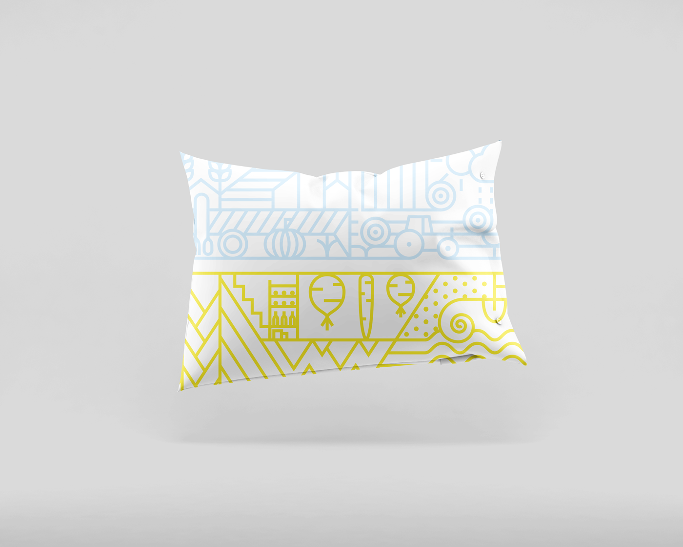
The design concept is based on a simple principle: cabbage (Kraut) grows upwards, and turnips (Rüben) grow downwards.
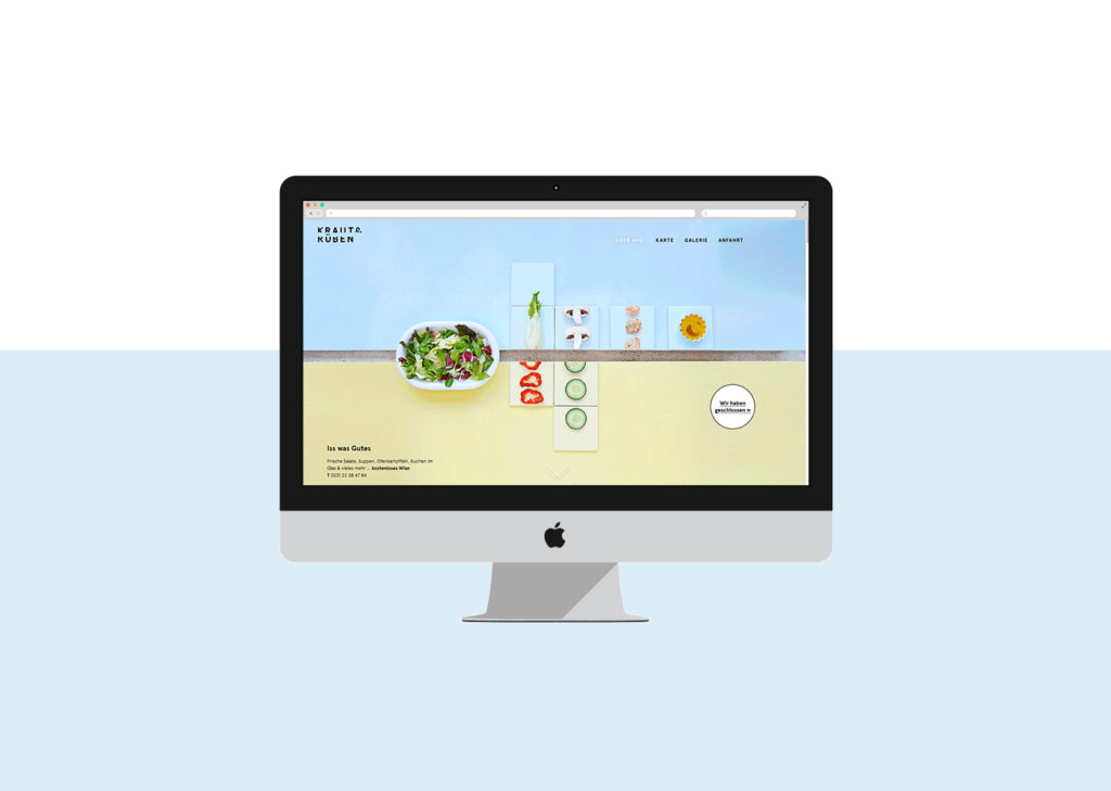
Webdesign
Photography
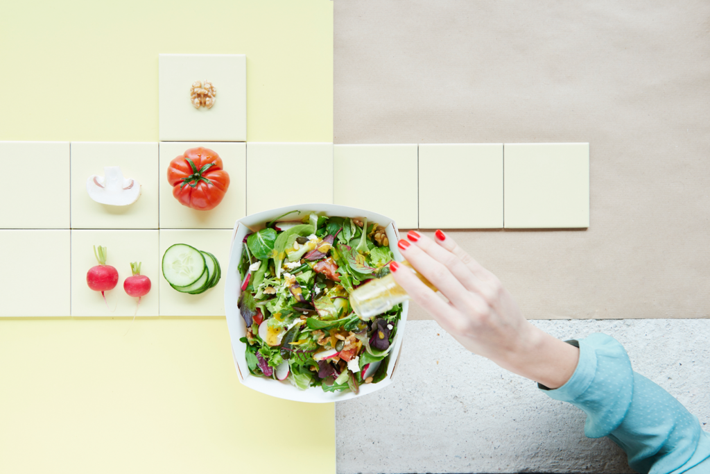
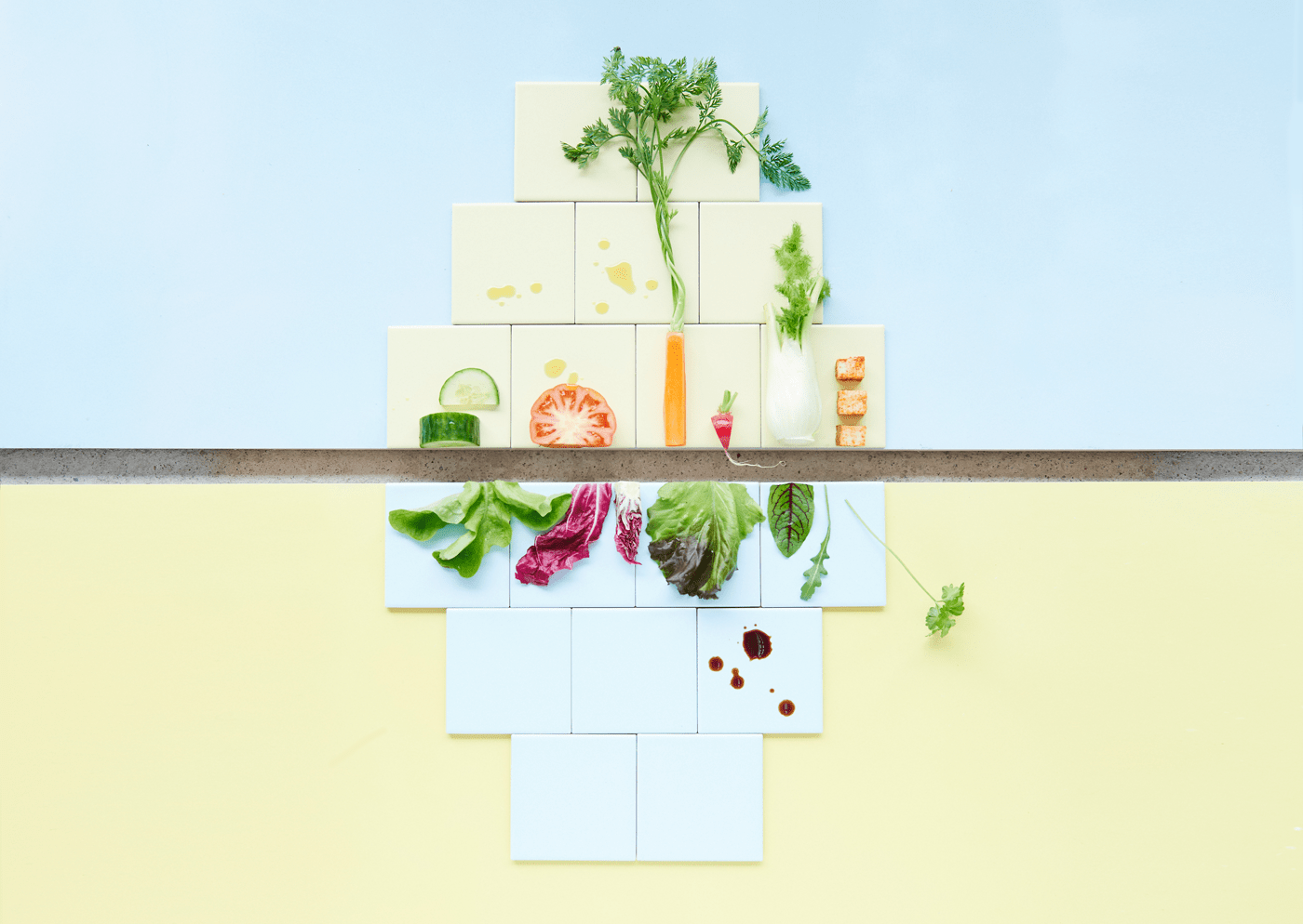
Avoiding the colour green, we tried to create a simple yet concise design without the typical clichés.
Interior Design

The upward/downward principle was applied to the logo, stationery, photography, and interior design.