Tans Brotboutique
Corporate Design
Branding
Web Design
Art Direction
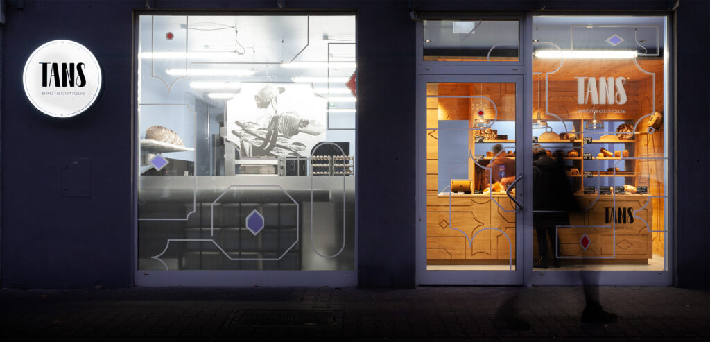
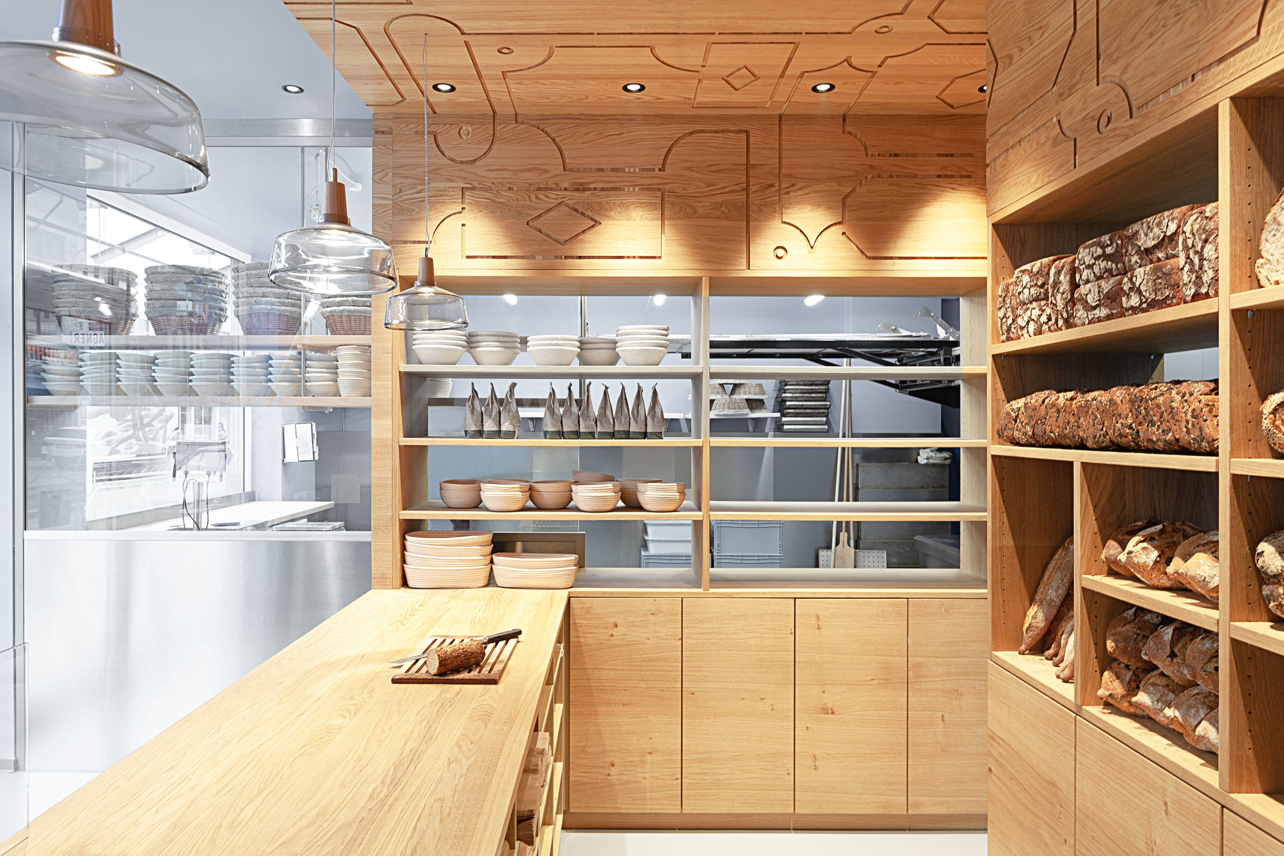
Interior Design
Interior and lighting design, construction planning and management: Mireille Solomon
Photos: Olivier Pol Michel
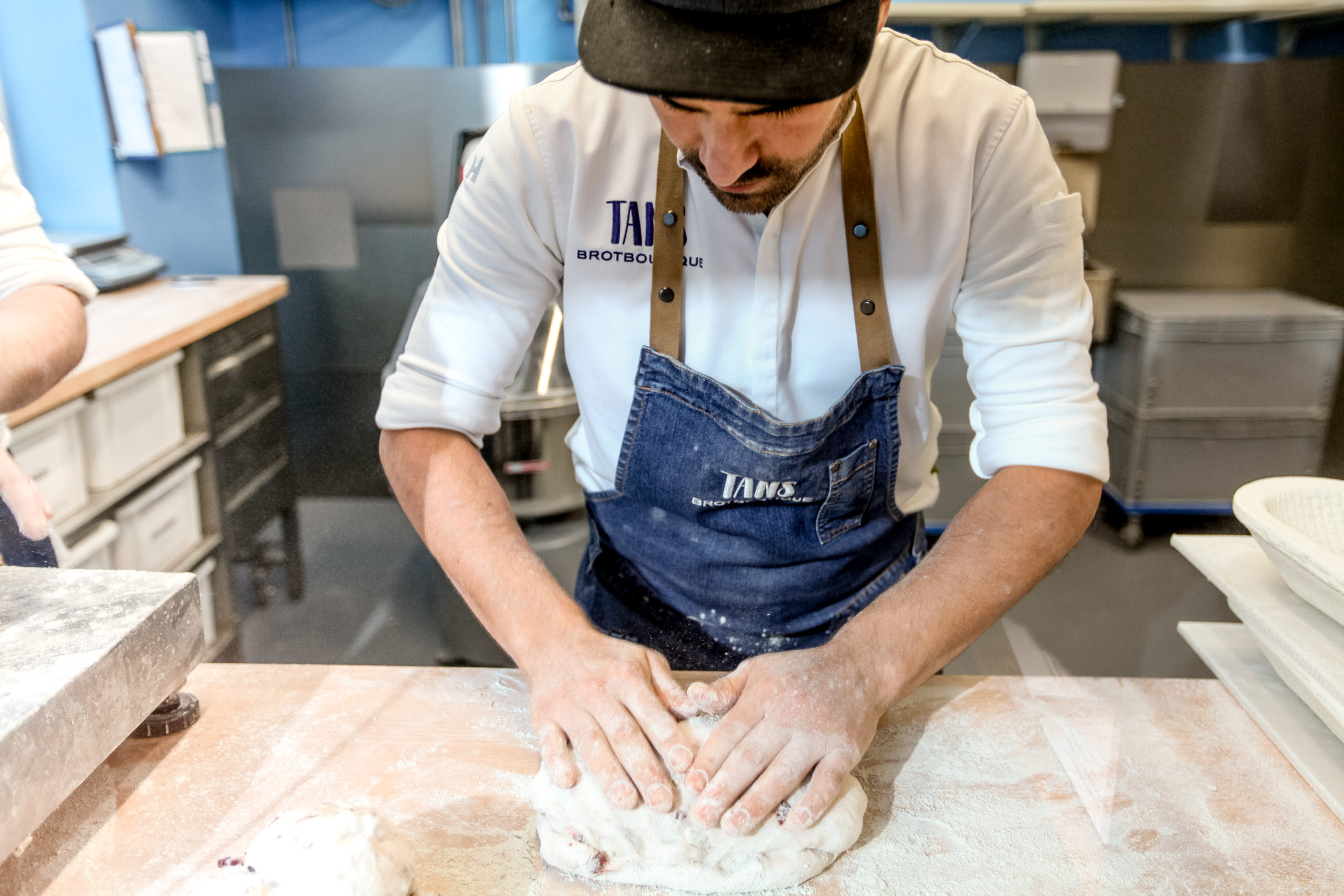
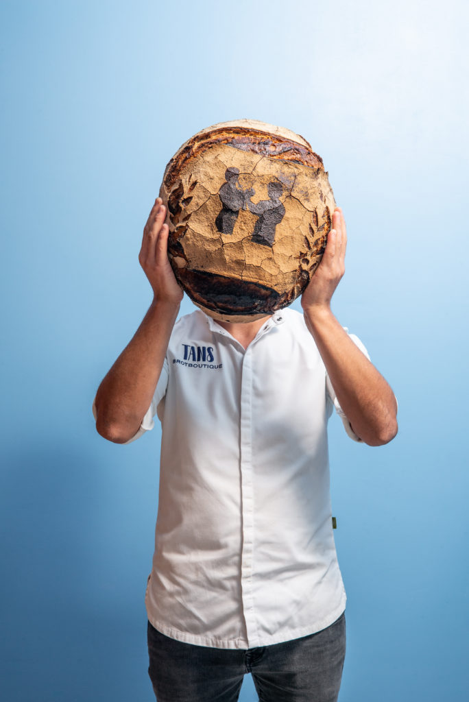
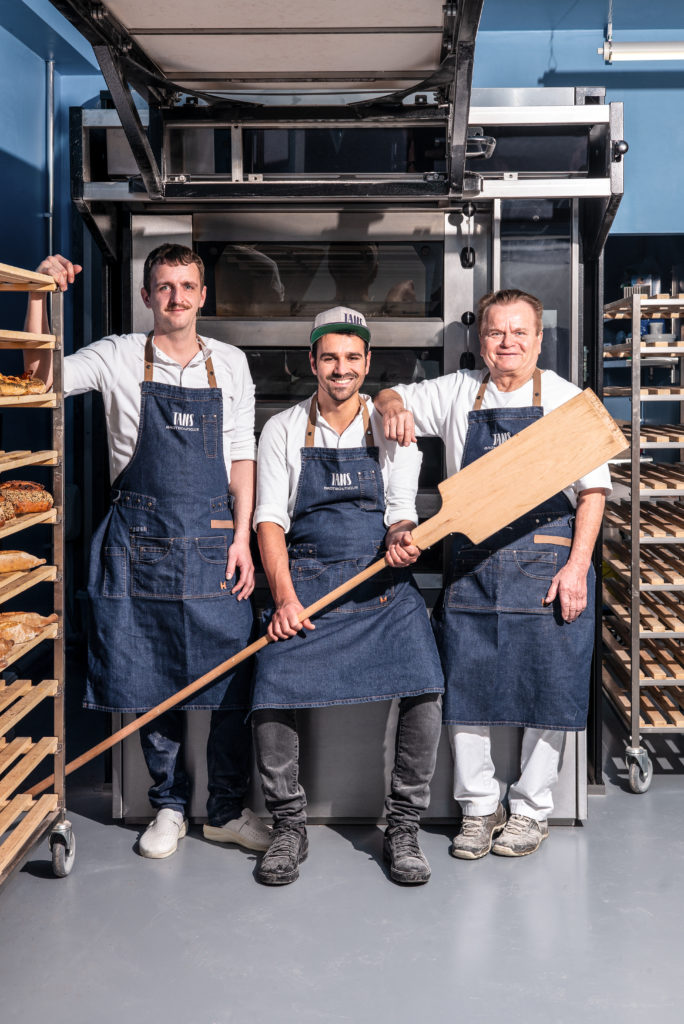
Allow me: This is Tan, the master baker behind this insanely delicious bread.
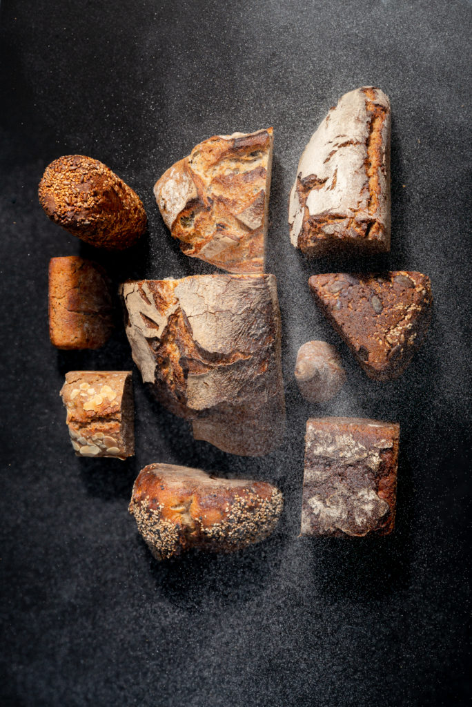
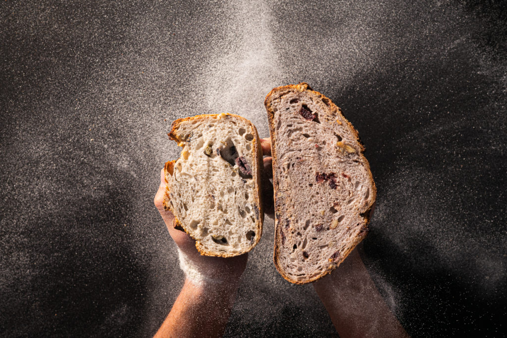
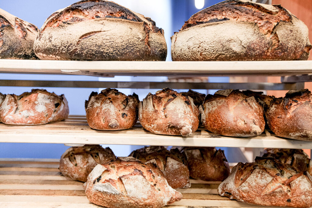
Natural ingredients, no additives
What makes Tan’s bread so special? Its own sustainably produced sourdough consists exclusively of natural, high-quality, raw ingredients. In order to make the best bread possible, additives such as enzymes or emulsifiers are completely left out and the flour comes exclusively from organic cultivation.
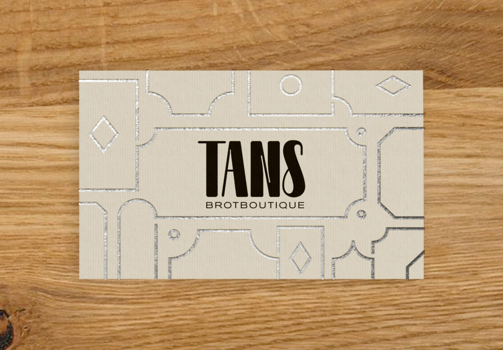
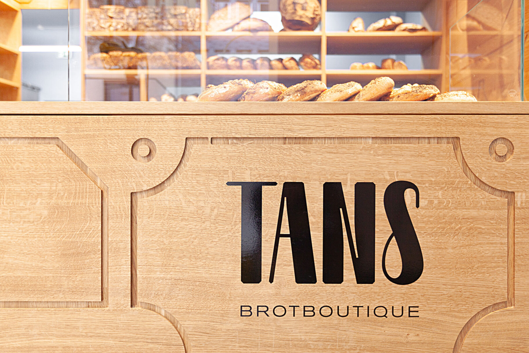
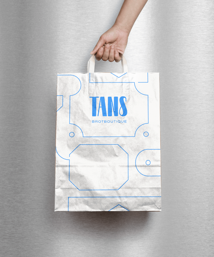
The logo is based on the Relaate font family by Alex Slobzheninov and was individually adapted for different application sizes.
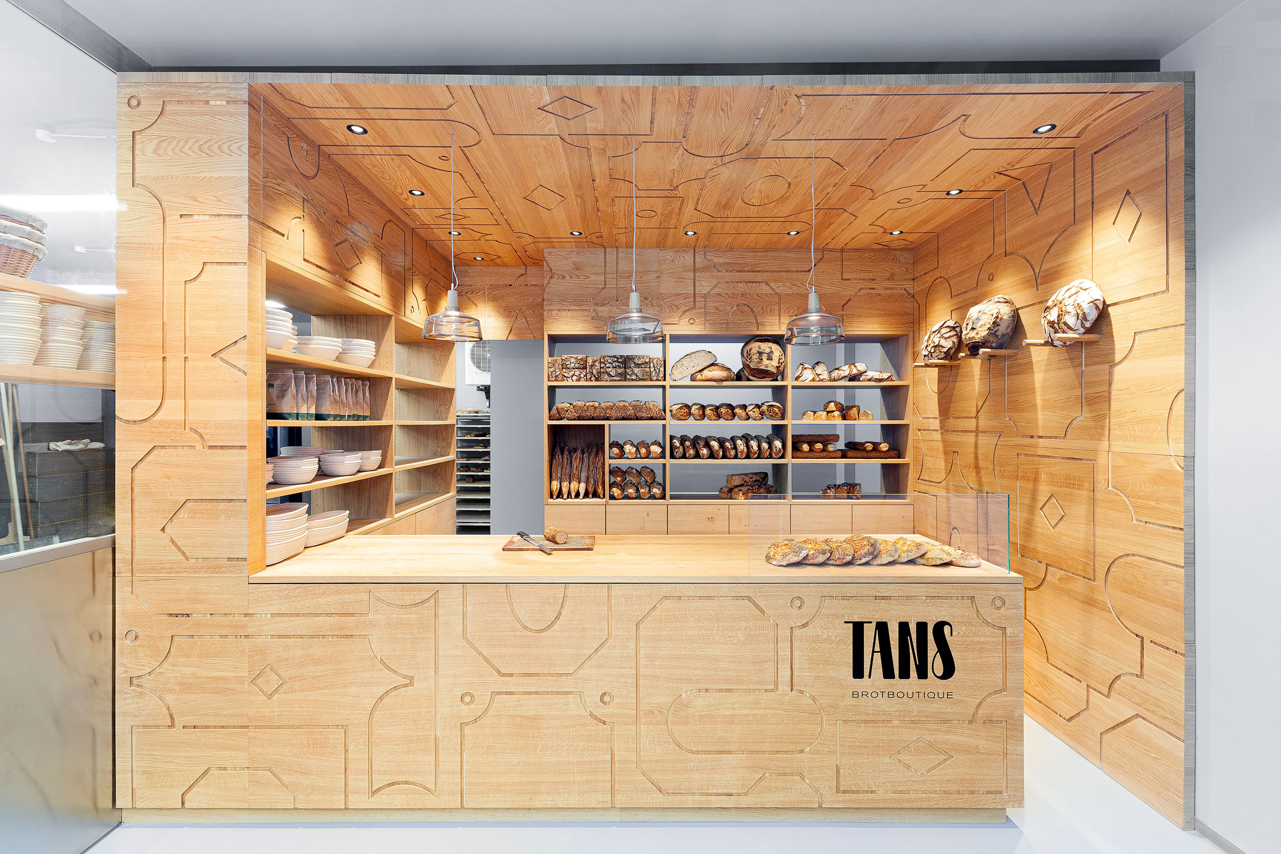
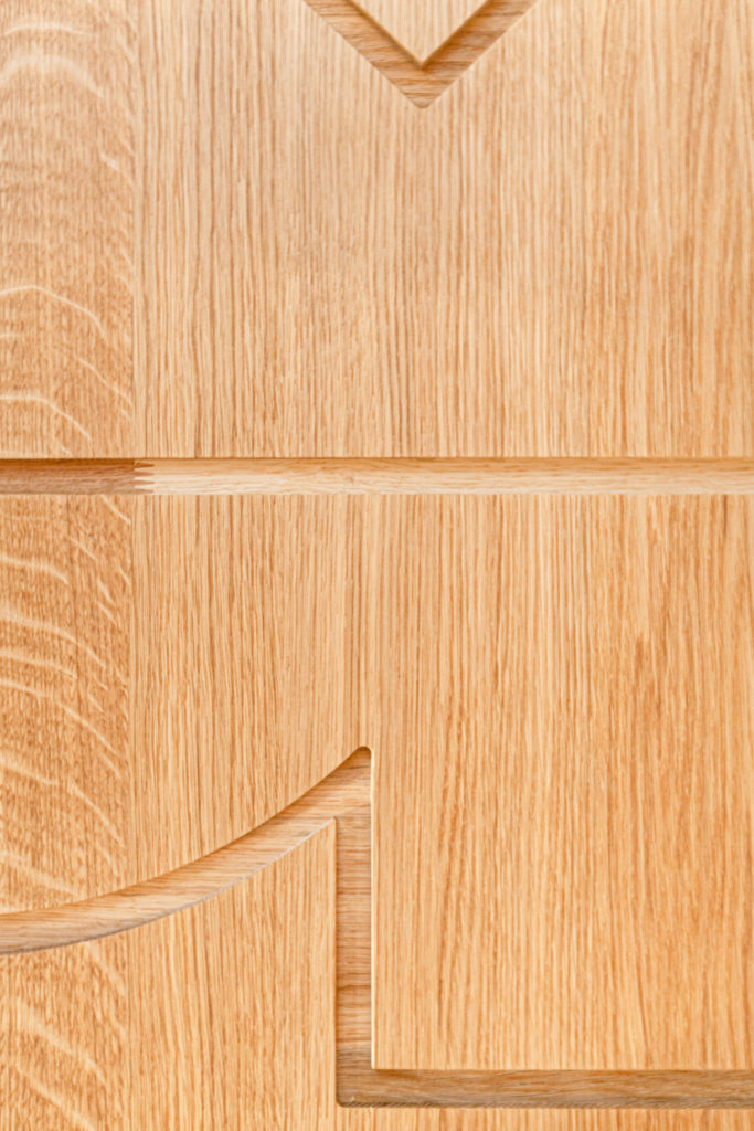
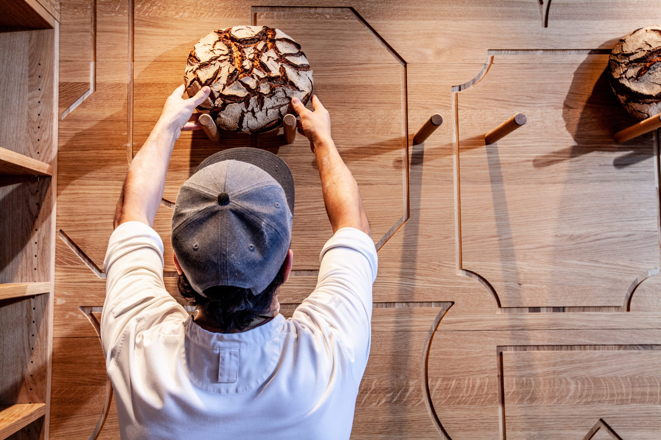
Patterns milled into the wood are reminiscent of the ornamentation of the Wilhelminian period. They serve as symbols for the art of baking, which had been forgotten but is in demand now more than ever.
Tan has worked his way deep into the craft of traditional baking, but his bread ideas are always fresh.
Voucher
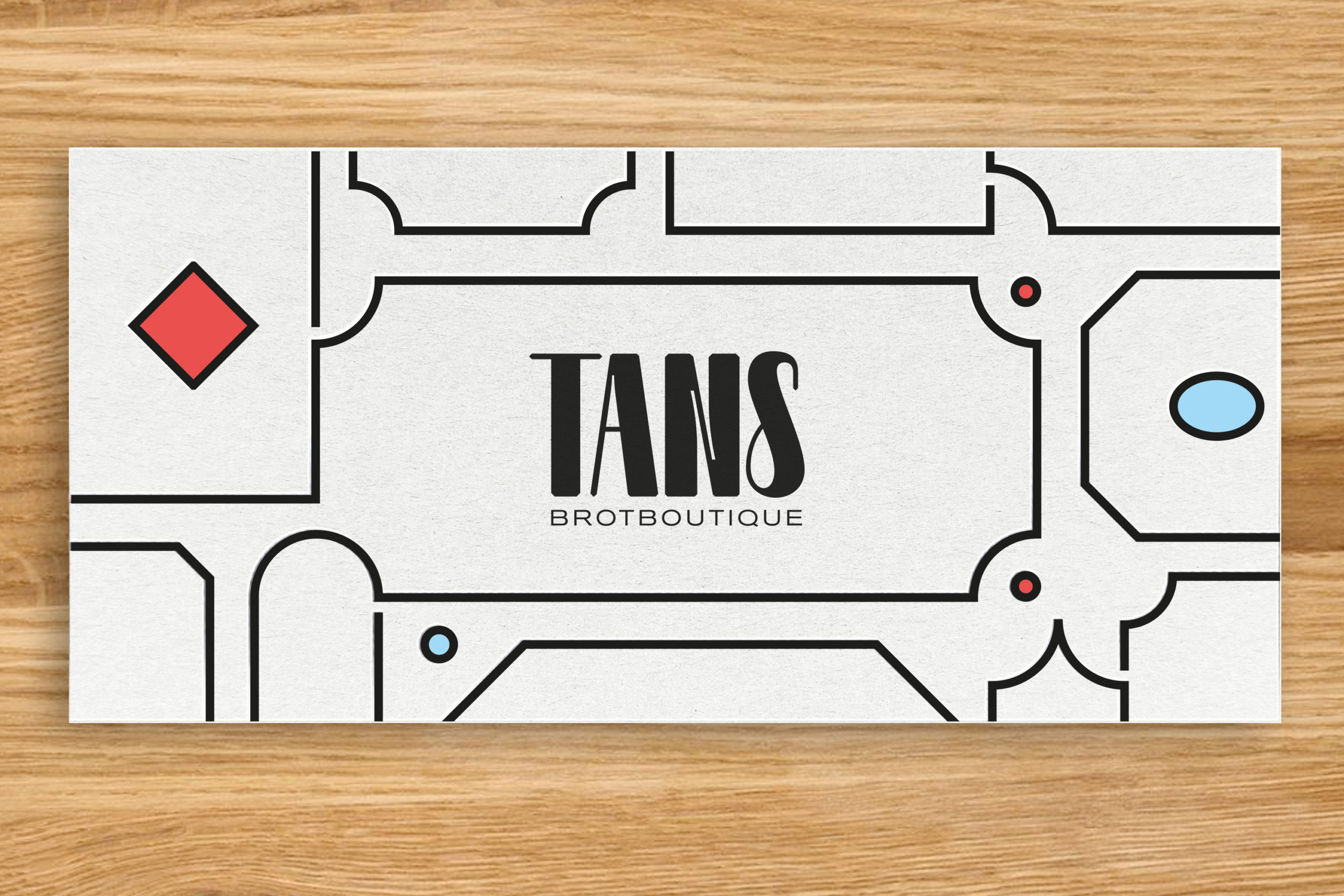

Such a pattern also runs through all analogue and digital media and is interpreted differently depending on the application. The logo is based on the Relaate font family by Alex Slobzheninov and was individually adapted for different size applications.

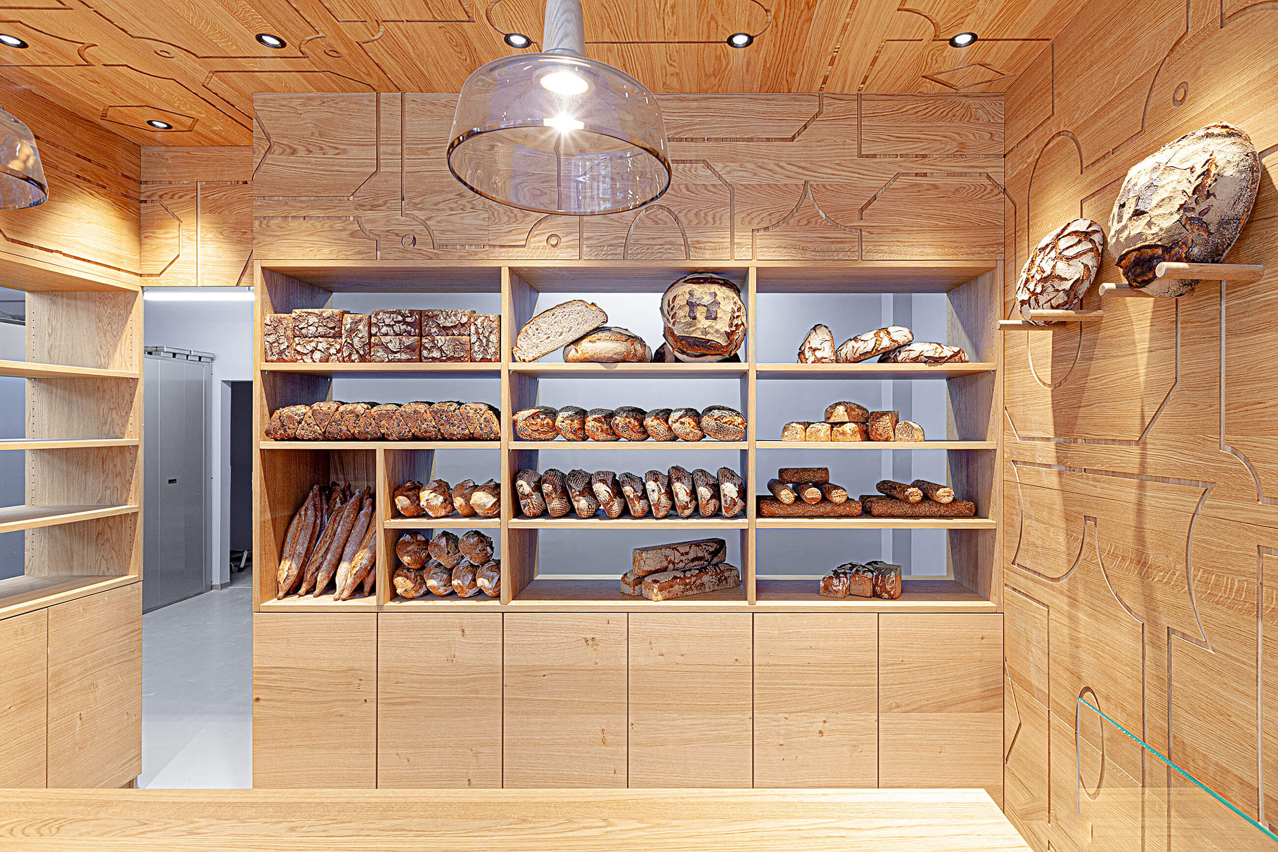
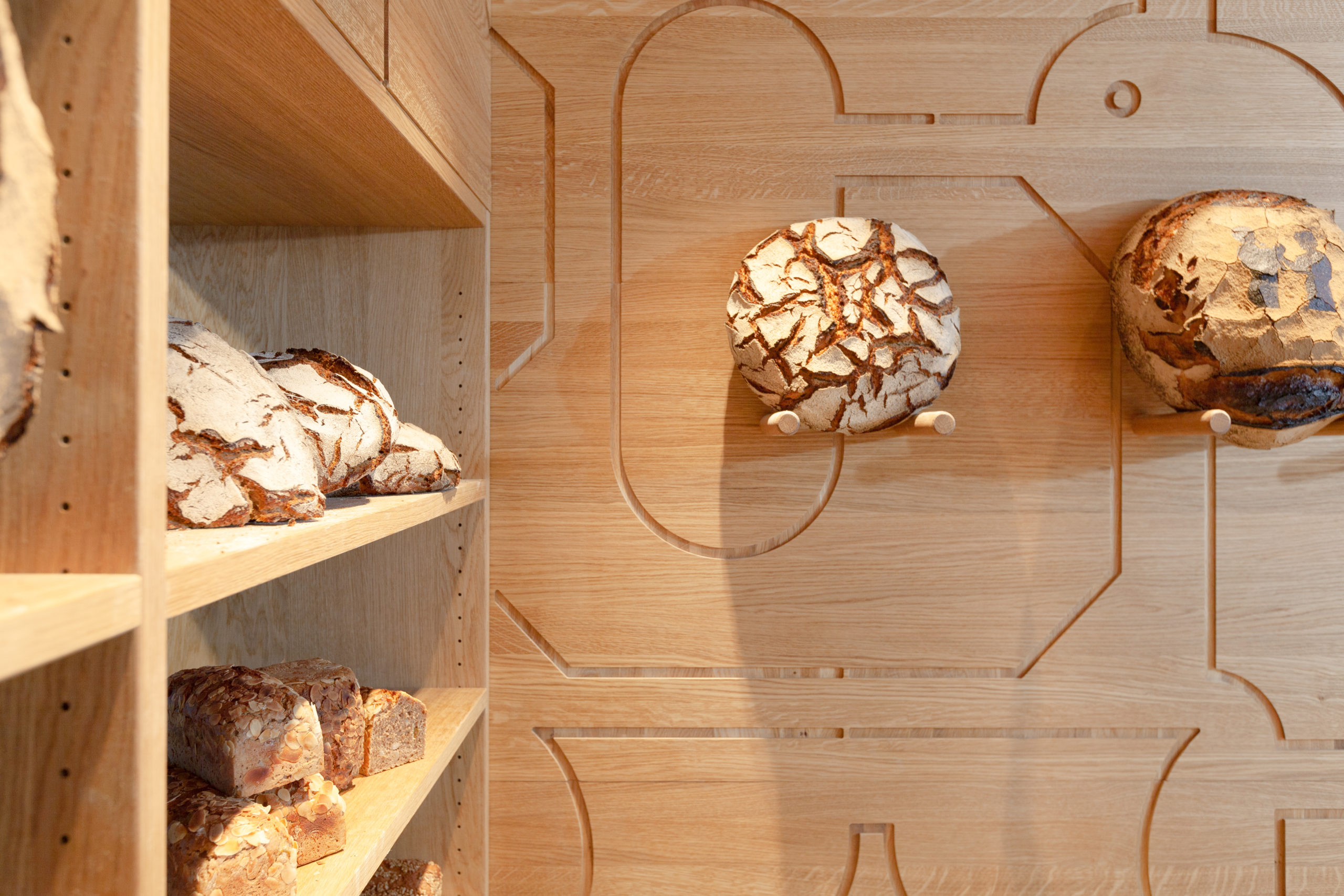
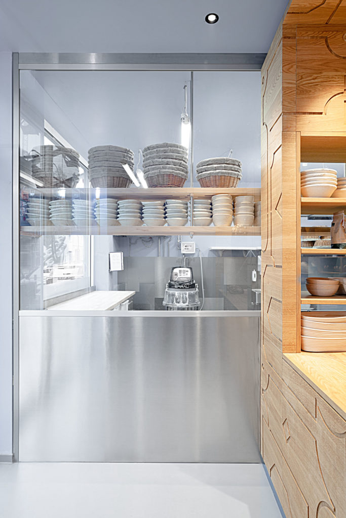
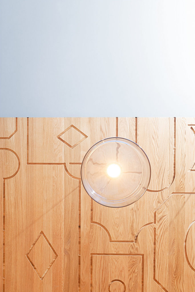
The design concept underlines these apparent contrasts, with a strong contrast between the cool, modern palette of the bakery and the very warm sales room that celebrates the old traditions—oak wood and warm light create an inviting atmosphere in which the extraordinary baked goods are shown to their best advantage