![Heimatdesign 159 Bearbeitet](http://www.brueckner.studio/wp-content/uploads/Heimatdesign-159-Bearbeitet.jpg)
Heimatdesign No 15
Editorial Design
Art Direction
Publisher: Reinhild Kuhn
Concept and project management:
Marc Röbbecke
Editor in chief: Jan Kempinski
Repros: Alexander Münch
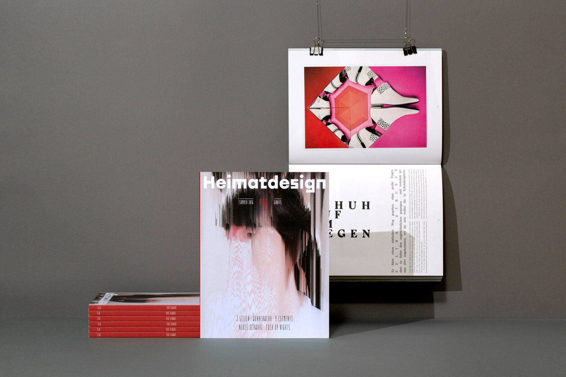
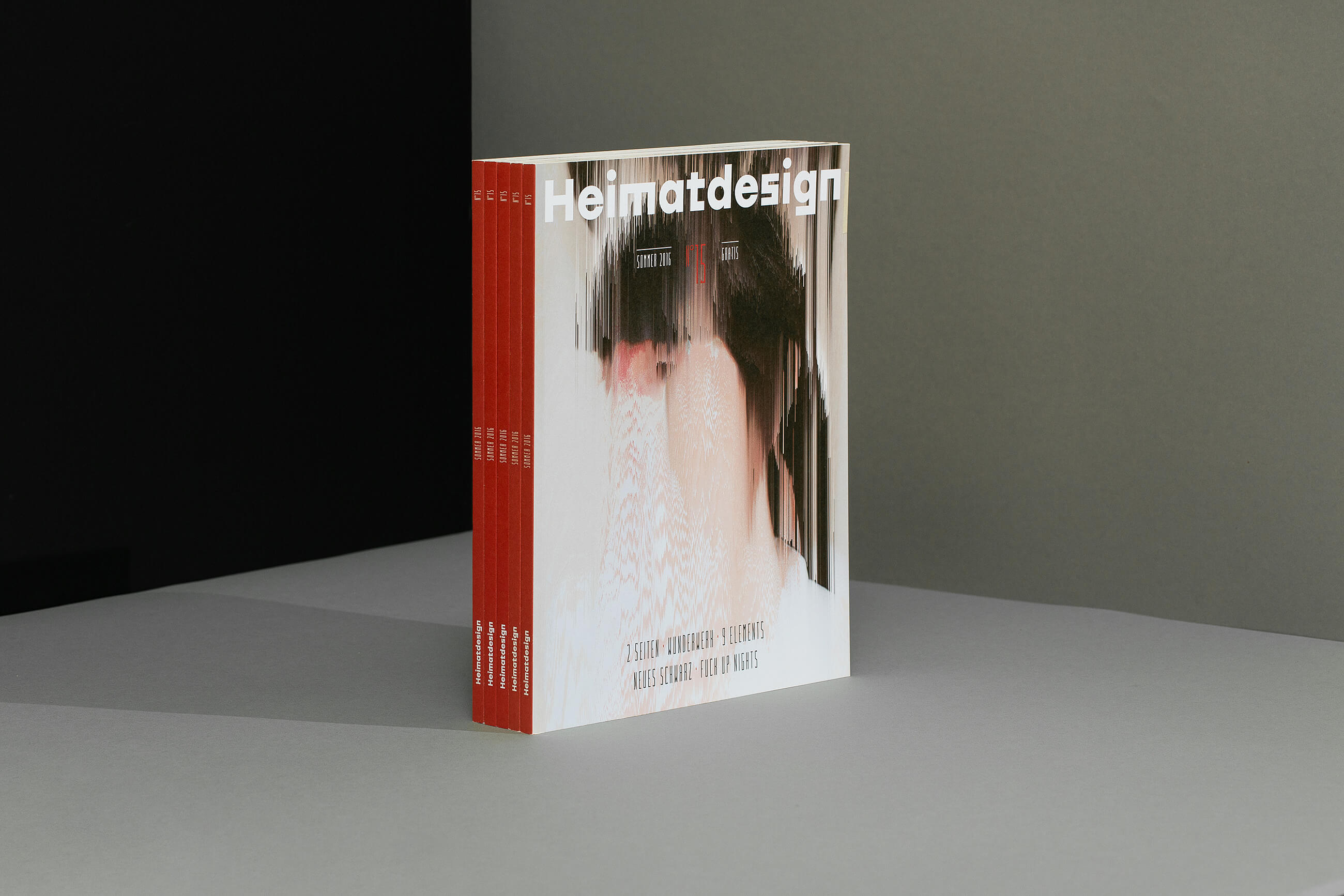
Heimatdesign is a platform and showcase for young design in the region. The magazine introduces the local design scene of the Ruhr area. Their 15th issue is dedicated to the topic of “failure”.
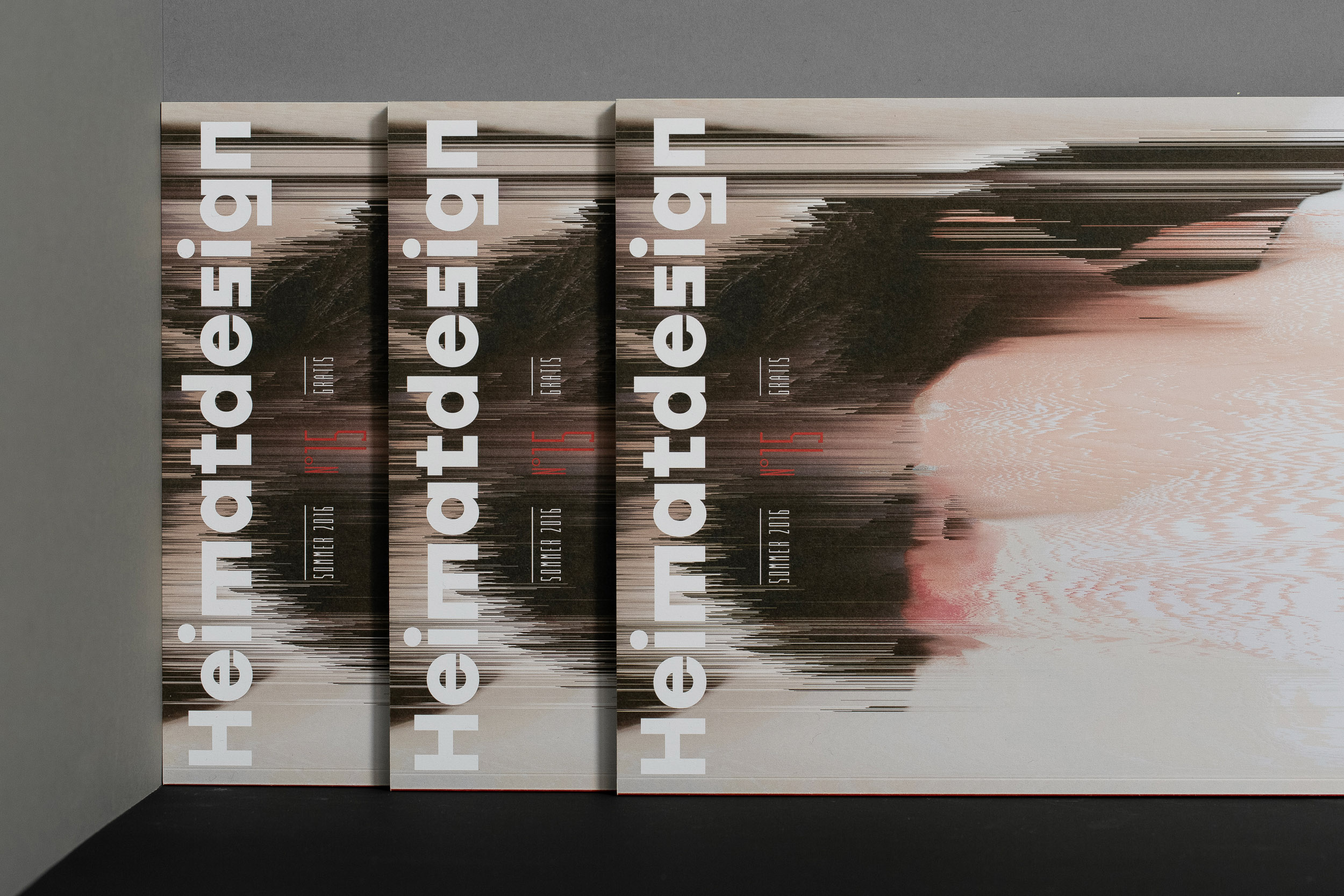
On its cover, we manipulated a picture from the magazine with the help of the Processing software.
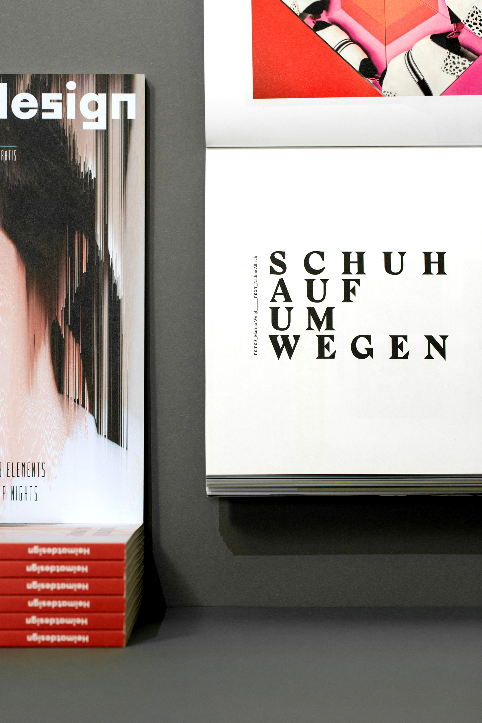
The typographic concept plays with the contrast between Ludovic Balland’s “Stanley” and Tomáš Brousil’s “Urban Grotesk”. The characteristic Stanley serifs underline the extremely graphic look of the layout.
![160615 Heimatdesign Repro 05](http://www.brueckner.studio/wp-content/uploads/160615-Heimatdesign-Repro-05-scaled.jpg)
![160615 Heimatdesign Repro 01](http://www.brueckner.studio/wp-content/uploads/160615-Heimatdesign-Repro-01-scaled-e1593089446981.jpg)
![Heimatdesign 125](http://www.brueckner.studio/wp-content/uploads/Heimatdesign-125.jpg)
![160615 Heimatdesign Repro 07](http://www.brueckner.studio/wp-content/uploads/160615-Heimatdesign-Repro-07-scaled.jpg)
The Ruhr district’s design scene is underestimated. So let’s present the wonderful work of its best designers.
![Heimatdesign 249](http://www.brueckner.studio/wp-content/uploads/Heimatdesign-249.jpg)
![Heimatdesign 107 Bearbeitet](http://www.brueckner.studio/wp-content/uploads/Heimatdesign-107-Bearbeitet.jpg)
![Heimatdesign 196 Bearbeitet](http://www.brueckner.studio/wp-content/uploads/Heimatdesign-196-Bearbeitet.jpg)
![Heimatdesign 099 Bearbeitet](http://www.brueckner.studio/wp-content/uploads/Heimatdesign-099-Bearbeitet.jpg)
![160615 Heimatdesign Repro 08](http://www.brueckner.studio/wp-content/uploads/160615-Heimatdesign-Repro-08-scaled.jpg)
![160615 Heimatdesign Repro 14](http://www.brueckner.studio/wp-content/uploads/160615-Heimatdesign-Repro-14-scaled.jpg)
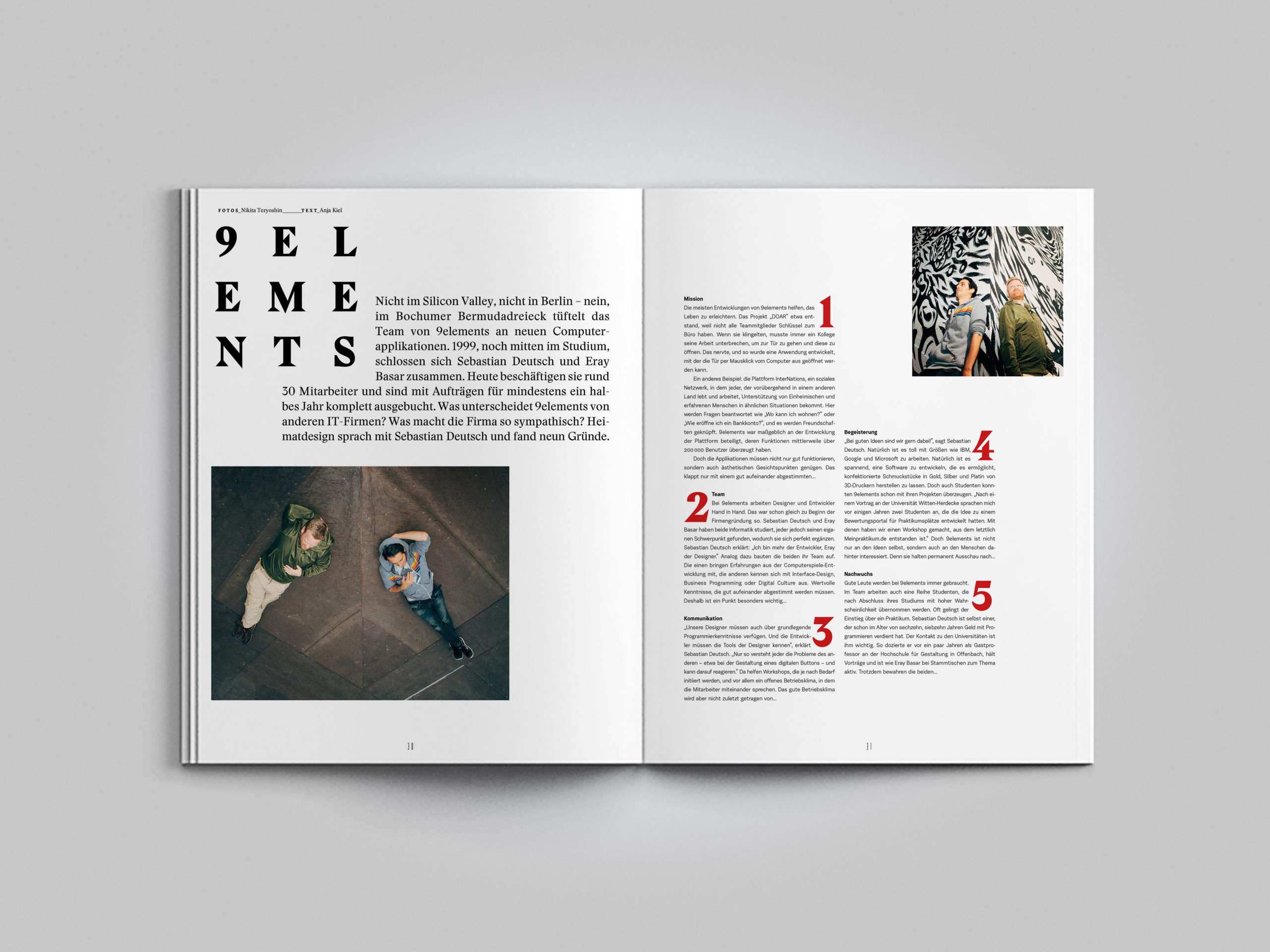
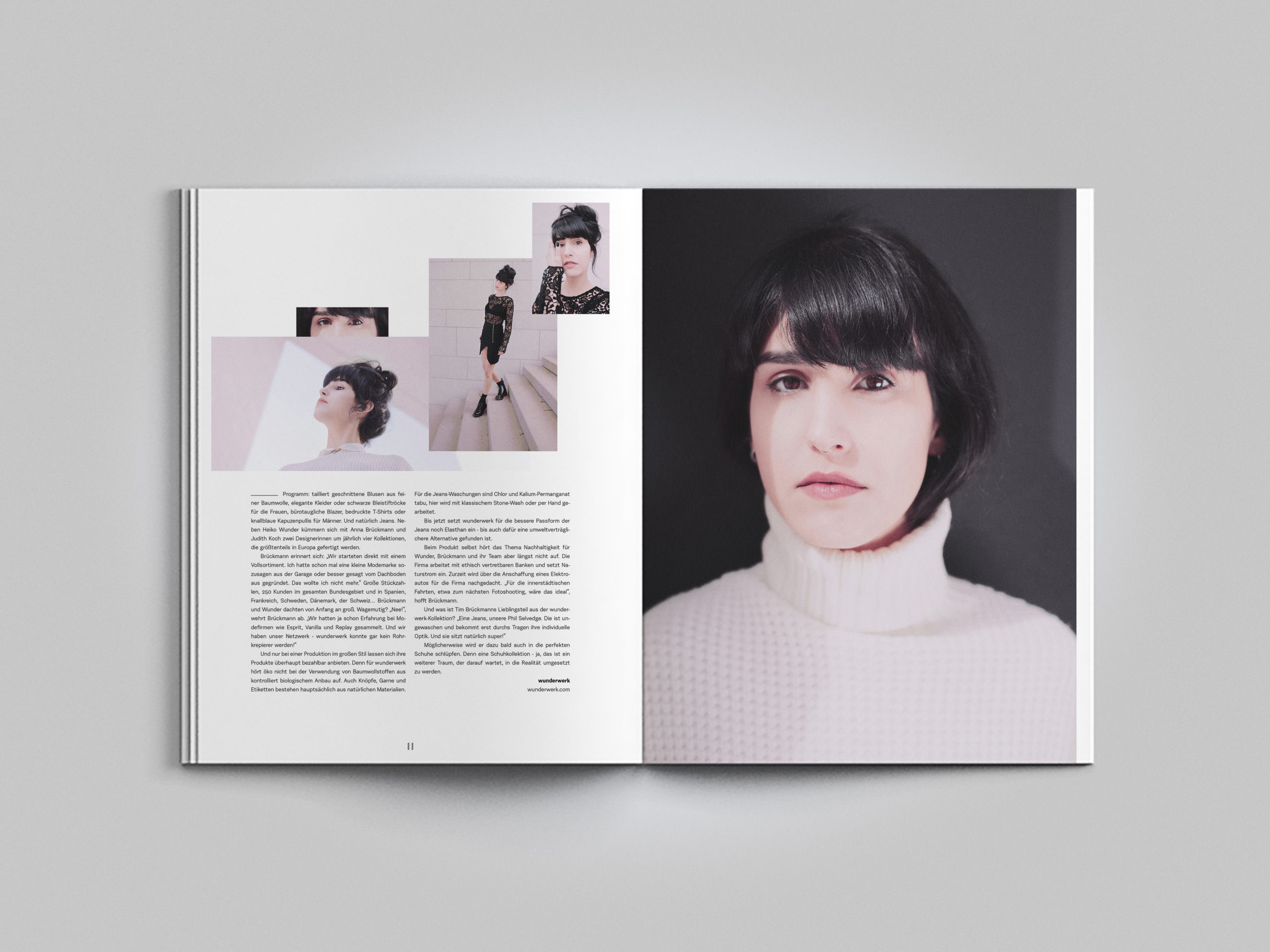
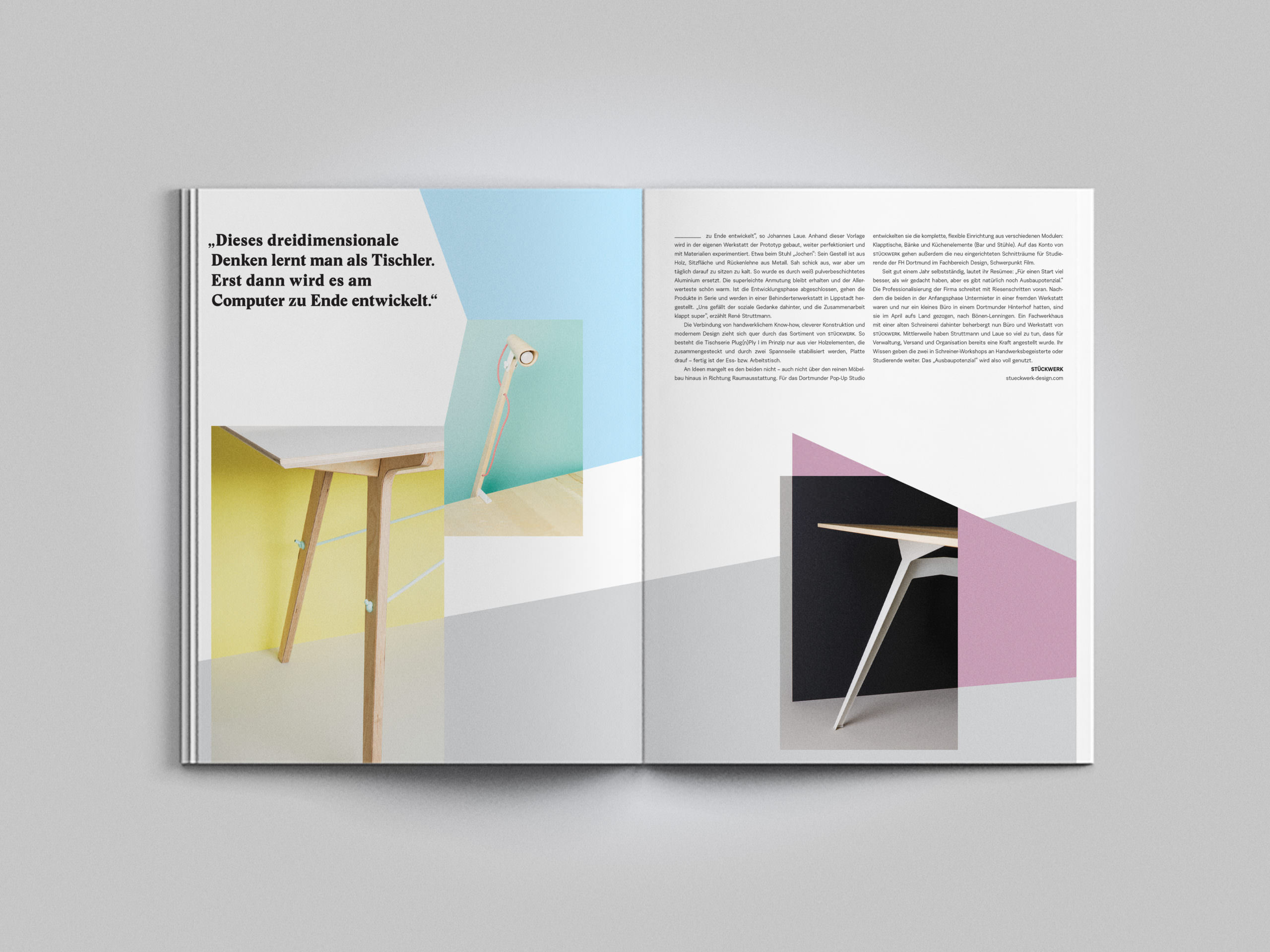
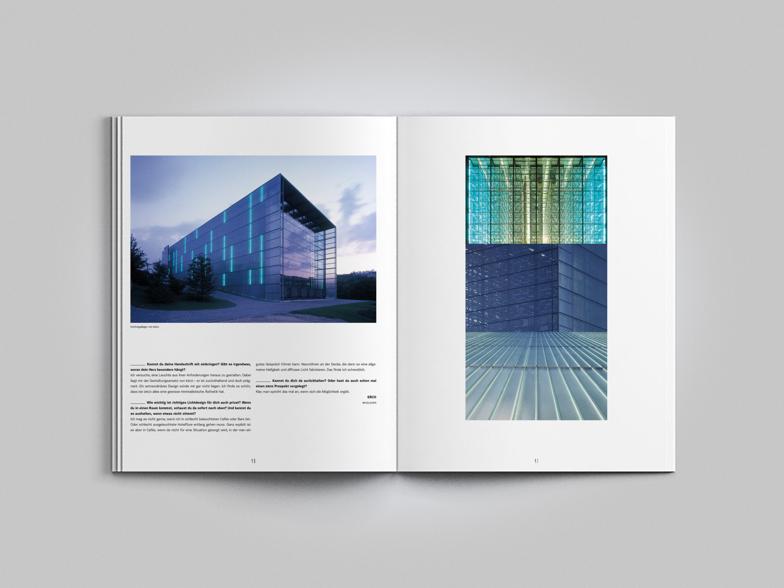
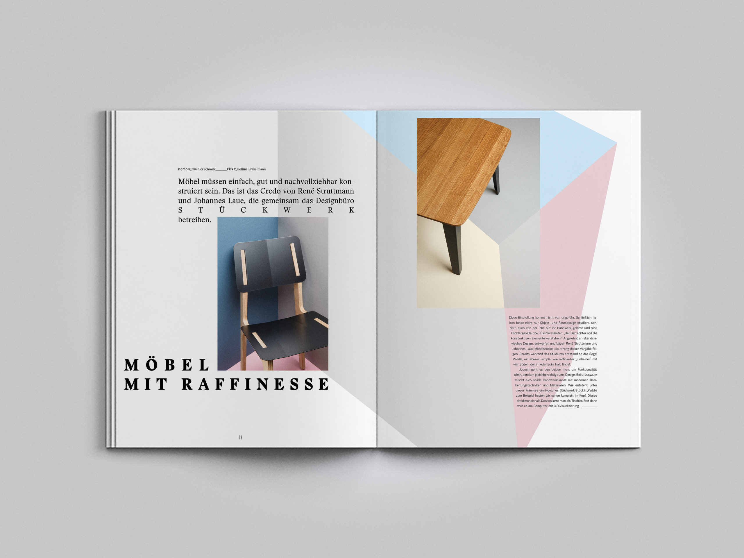
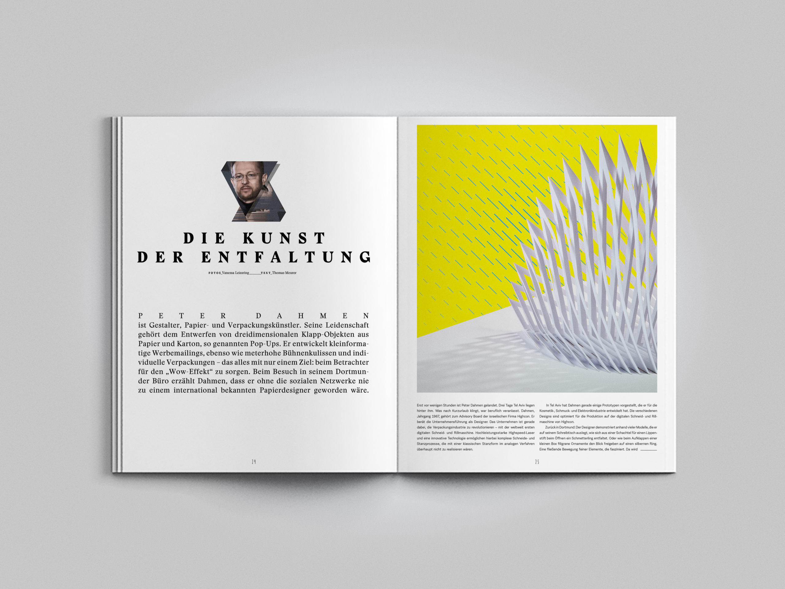
The visual language communicates with the magazine’s concept: 1. Whether illustration, infographics or photography: all images are as clean and minimal as possible. Backgrounds are reduced to become calm, graphic surfaces. Visible lines in the background follow geometric shapes. 2. A detail in the picture is altered through retouching. The flawless appearance of the motif is thus disturbed and underlines the theme of “failure”.
![160615 Heimatdesign Repro 04](http://www.brueckner.studio/wp-content/uploads/160615-Heimatdesign-Repro-04-scaled.jpg)
![160615 Heimatdesign Repro 17](http://www.brueckner.studio/wp-content/uploads/160615-Heimatdesign-Repro-17-1024x768.jpg)
![160615 Heimatdesign Repro 02](http://www.brueckner.studio/wp-content/uploads/160615-Heimatdesign-Repro-02-1024x768.jpg)
![160615 Heimatdesign Repro 10](http://www.brueckner.studio/wp-content/uploads/160615-Heimatdesign-Repro-10-scaled.jpg)